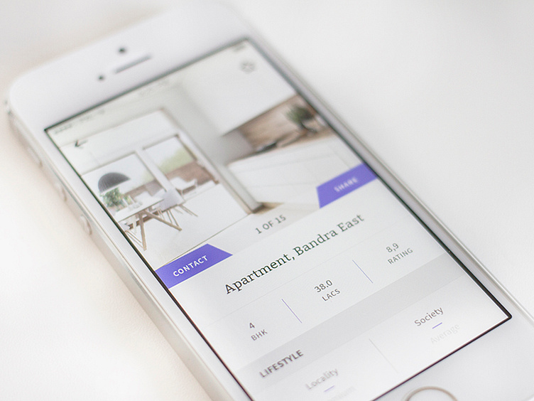
Property Detail
This is the detail screen of an app I worked on. The screen has lots of small bits of information that I tried to lay out in a way that was clear without feeling too busy.
Part of the 'not feeling too busy' was the color palette which was kept super simple throughout the project. We mainly used whites and greys and opted for purple as an action color.
The two purple buttons are the ones you should be able to find immediately, hence the color purple. I wanted to try a different form of button to make this feel more dynamic and I really like the outcome.
More by Kim Wouters View profile
Like
