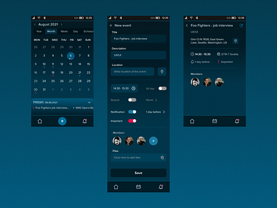
Calendar Dark interface
This was a fun project with the focus on dark interface. I decided to create a calendar app with only important elements and actions. This project was created as a part of UI Learn online course by Denislav Jeliazkov.
Challenges I faced and how I overcame them:
1) I didn't want to create a boring dark mode, so I included a dark blue gradient in the background. It turned out to look awesome.
2) At first typography was all white and it looked crowded, so I changed the colour of the less important elements to very light blue. This was also more pleasing to the eyes if you consider using the app in the dark.
3) The calendar screen was taking a lot of time to create until I learned how to use auto layout. It made all the difference and saved me a lot of time.
4) On the second screen (create a new event) I had some difficulties with input fields since the background colour is changing. I played a little with colours and made input fields in gradient colours that fit with the background. It turned out to look beautiful and consistent with the background.
What I learned:
1) How to make a boring dark interface fun and beautiful.
2) How do rules for dark interface differ from lighter design.
3) How to use layout.
4) How to have fun with gradient and elements on gradient background.


