ats
Thought I'd show a little bit of process behind this rebrand I'm working on.
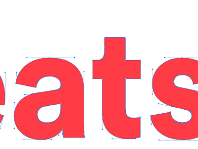
It's worth noting (and learning, for you folks) the way I made the portion of the ascender above the crossbar thinner than that below the crossbar to make the letter appear more balanced when looked at in a normal zoom setting. I've also made the crossbar itself thinner than the bottom portion of the ascender for the same purpose.
Another thing I've done here that's worth looking into for your own wordmarks is the way I curved the tail of the 'a' ever so slightly to cradle the 't'. This detail is included in many fonts, but more often than not most of us don't even think about it being there.