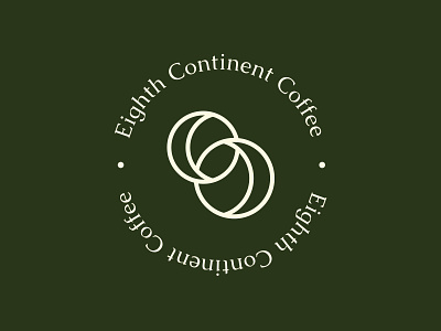
Minimal Badge Logo Design For A Coffee Company
We designed the main element of the logomark using a combination of two C’s opposing each other. The letters combine to form the number ‘8’ angled at 45. We paired this with an elegant serif font to give the logo a simple and sophisticated look.
Hop To Us To View More Projects
Follow the White Rabbit 🐇 Website | Instagram | Facebook | Behance | Pinterest | YouTube
Like what you see? contact@whiterabbit.nz
More by White Rabbit View profile
Like


