Cedar Construction
Construction companies seem to be a recurring brief in the studio recently, as you can tell by our portfolio. It’s a curious thing, developing an identity for a company whose sole purpose is to create themselves. Perhaps a more raw approach to ‘making’ than ours is, but there is overlap and a shared venture in both endeavours - to make beautiful, functional ‘things’ for our clients. That could be your new home, or it could be your brand. But Cedar didn’t come to us to renovate their offices… no, no. They came for a (brand) spanking new brand and website with all the usual trimmings (Christmas nod) - and we were happy to oblige.
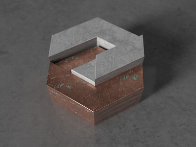
Happiest when initiating projects from the foundations up (cheeky) - we were chuffed to kick this off with brand work - our dream launch point. The marque selected is a strong, bold identity whose form shows two isometrically-interlocking C-shaped structures to note the recurring Cs in the namesake.
However, those Cs also form rooms, or levels, of a building - describing the notion of construction in a very literal fashion. These structures stack on top of each other to form a hexagonal shape that speaks of strength, solidity and precision. Accompanied by no-nonsense typography that eschews any sense of artifice or unnecessary ornamentation, this is a brand with heft and weight to match the company's output.
Meat devoured; onto the trimmings. Following brand sign off, we got knee deep into the collateral work, including stationery and business cards, before tackling the digital side and spinning out an engaging website and social media toolkit. But before collapsing into a food coma, we will let the images do the talking from here.
Another happy studio, another happy client. Thanks Cedar Construction.


