🌈 Meesho Colour Library
Looks aren’t everything. Yes, a visually-appealing colour palette is important but what matters the most is how it affects your users’ experience.
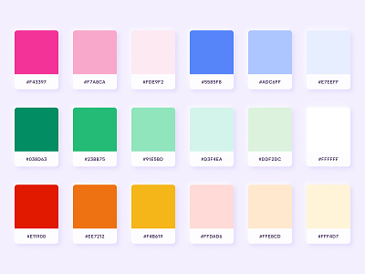
Pink, as our primary colour, reflects the spirit of our brand. While most brands associate pink with feminism, we believe it’s much more than that. It elicits a feeling of joy, freedom, warmth, grace and elegance.
Our secondary colours - Green, Yellow, Orange, Red and Blue - have been carefully picked to complement the primary colour. They help users navigate information, understand the context, and create a visual hierarchy.