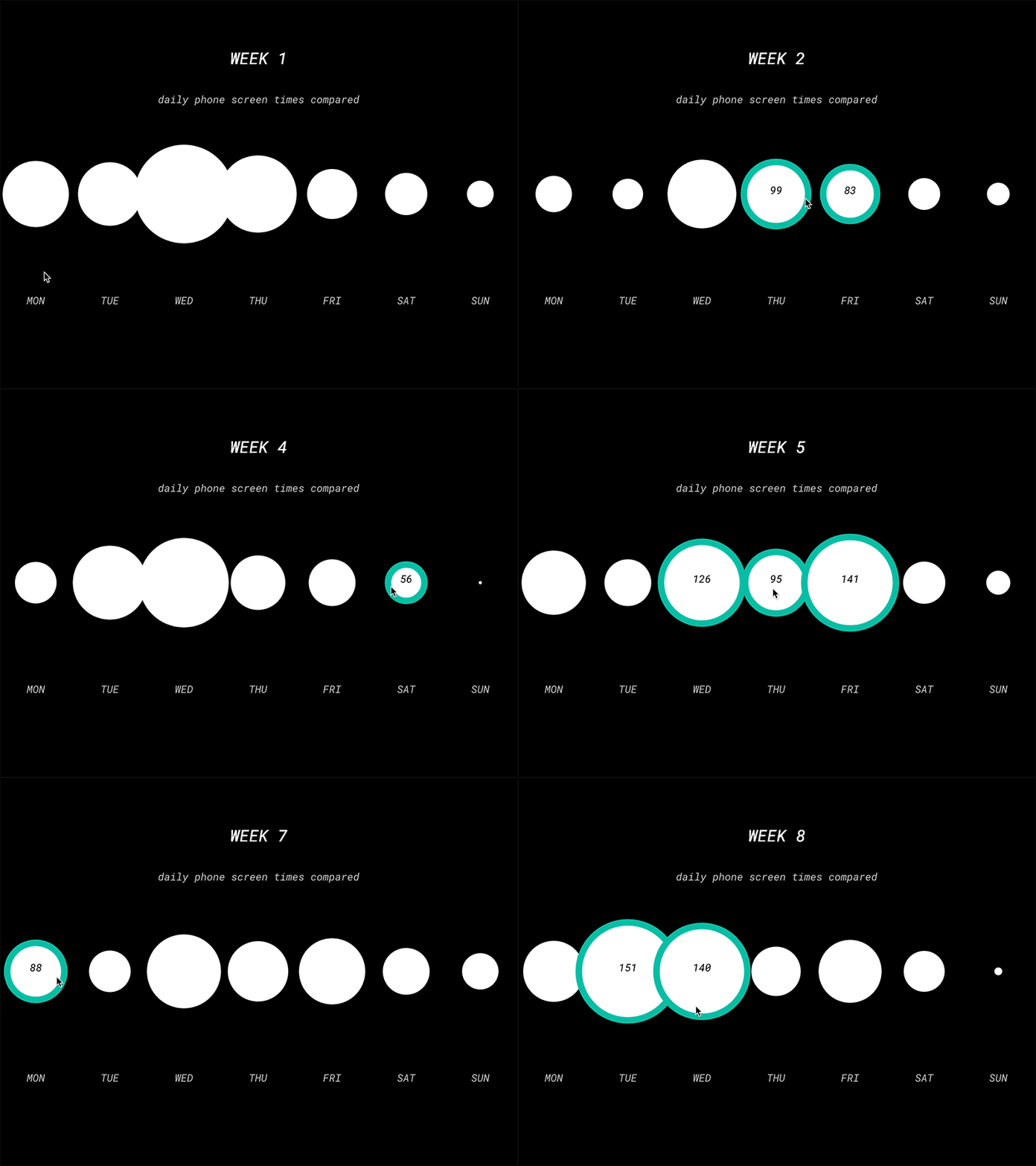
Phone screen time data visualisation with p5.js
I'm learning p5.js and as a part of my homework I had to visualise some data about myself. This interactive graph compares daily time that I spent looking at my phone over an 8 week period. The bubbles change automatically over time to reveal the data from the following week. It's not very great UX wise, but it's a fun exploration of what can be achieved with some data and p5.js :)
More by Auguste Greiciute View profile
Like
