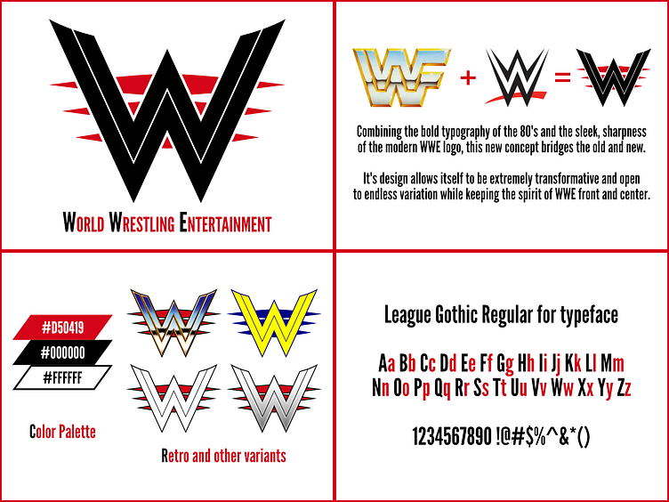
Design Guide: WWE Logo Redesign Concept
Oh? A Brucie Bonus? I shouldn't have~
Tried something new today with the logo concept: A Design/Branding Guide!
You see a lot of these with bigger companies. Strict guide lines for things like color use, spacing, font choices, etc etc. Can't say it's something I've done much off since I've only do smaller Twitter commission work.
This was more of a test to see if I could do something like this, should the opprotunity show itself before me. And I think for a first time, not bad! I know I'm missing other aspects such as the grid outlines that show how the logo is made, but I'm simply working within Dribbble's resolution and I could only fit in so much.
Perhaps more work is in order? We'll have to see!
---
Twitter | Portfolio Site | Open for Commission and Freelance work, DM if interested!
