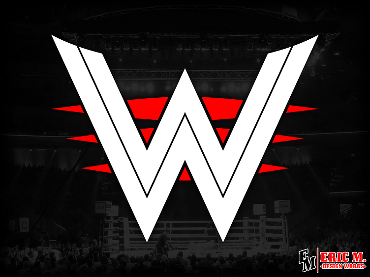
Design Concept: WWE Logo Redesign
Another from that design list, my own take on the WWE logo!
Bridging the gap between old and new, I took the bold of the 80's Hogan era logo and mixed it with the more angular and pointed look of the current logo. Also added in two more red streaks so it can act the 'E' in WWE!
Seriously, that always bothered me that they never did that. It was literally right there. Would've been super good to add when they had to switch from Federation to Entertainment.
Anyways, it remains recognizable AND can be used in so many color pallets! I think it could totally work
---
Twitter | Portfolio Site | Open for Commission and Freelance work, DM if interested!
More by Eric M. View profile
Like
