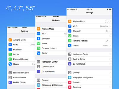
4", 4.7", 5.5" Size Test


NOTE: As of the Apple conference, the pixel sizes are still correct here, however they are downscaling the 1242x2208 to 1080x1920.
The other week John Gruber published his thoughts on what the new iPhone's pixel dimensions could be. It's extremely well thought out, so we wanted to see how it might affect the amount of space we have to work with.
So in the shot you've got the 4" iPhone 5, and the 4.7" and 5.5" iPhone 6. Here's the Sketch file I mocked these up in. I've tested with both the Settings app and the Alarm section of the Clock app.
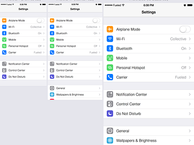
Point Comparisons: Settings App and Clock App. This shows the difference in space you have to work with.
Pixel Comparisons: Settings App and Clock App. This shows how much more detail you're getting from 3x on the 5.5".
The width increase is creating plenty of room in the header and tab bar. Perhaps we could see more than 6-7 tab buttons appearing in future, with smaller screens bucketing them into a 'More' tab when it can't cater 5+.
The height increase is allowing for more content too, which may create some tweaks needed for app screens that are designed to fill up the entire viewable space.
It'll be good to see how Apple handles @3x on some of their assets though - some of their icons scale fine and remain crisp, but others that have 1px details or weren't aligned to a @1x grid can get a little fuzzy. That might not be a concern though, perhaps at this PPI they don't imagine users will see the difference.
It'll also be fun to see if users start orienting their iPhone in landscape more. At the moment it's not a great browsing experience, and a lot of iPhone apps don't handle it very elegantly, or ignore it entirely. The 5.5" might be too much for single-handed use, so we may get people using it in a fashion similar to the iPad.