iTunes 12 — Isn't it better this way?
I've been useing Yosemite Beta with iTunes 12 for a while. And I really confused by iTunes' controls positioning.
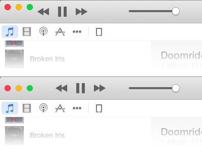
On the top: original. On the bottom: with my small adjustments.
Which one do you like more?
I've been useing Yosemite Beta with iTunes 12 for a while. And I really confused by iTunes' controls positioning.
On the top: original. On the bottom: with my small adjustments.
Which one do you like more?