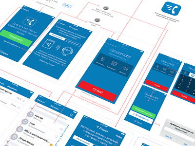
Zingaya UX and UI
Redesign of Zingaya iOS map
Zingaya lets you make free calls from websites that have Zingaya widget embedded or to any company from our catalog
User Experience design takes into account that app will be usually downloaded after user clicks a button on a site. It was essential to improve the flow for "site> app download>make a call"
-------------------------------------------------------
Old UX. Initial flow
1. User is on site (mobile) that uses Zingaya and has "Call us online" button.
2. User taps "Call us online", go to Appstore, download the app, opens it and see a welcome text about Zingay's.
3. User switches back to Safari and click "Call us" button again, app starts and makes a call.
-------------------------------------------------------
New UX designed by keepa. Initial flow
1. User is on site (mobile) that uses Zingaya and has "Call us online" button.
2. User taps "Call us online", go to Appstore, download the app, opens it. There is a welcome screen with big Make a Call button.
3. User taps Call button and app switches to Safari, that opens a special Zingaya site URL that uses cookies (from the initial site) and automatically switch back to app and start a call.
So as result user do not swtich by Safari by himself, everything works automaticall, we added Make a Call button to home screen.
We also kept in mind rare cases for app being downloaded directly from Appstore
-------------------------------------------------------
Zingaya UI
Main idea is to keep as less visual uniqueness as possible to keep Zingaya feel just a "tool" and not to mess with brands of companies that use Zingaya.
Appstore https://itunes.apple.com/ru/app/zingaya/id598560930?mt=8
Full UX map attached (rus)

