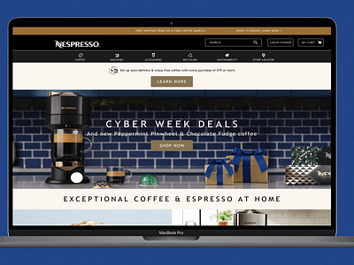
Nespresso Homepage Re-Design Concept
Inspired by my coffee-drinking parents, I made some small adjustments to create a re-design concept of Nespresso's homepage. I replaced the icons with ones that more closely align with the description (i.e. the bean icon for Coffee or the leaf for Sustainability) than what's currently on their website. I also added a "Learn More" CTA so customers can find out more info about auto-deliveries. In addition, I included a Covid-19 update link to answer any potential shipping questions.
Created with Figma.
More by Heather Sterman Ashley View profile
Like
