Booking redesign


Have you ever found yourself lost or confused when you wanted to book a place to stay online? I have and that is why I have created a concept for the Booking website as a part of the UI Learn online course by Denislav Jeliazkov. The reason I chose to redesign the Booking reservation website was because at the time I was working on this project, Booking had their old website still working and it was overwhelming with information.
Challenges I faced and how I overcame them:
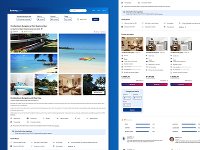
1) How to reduce the number of elements that had colour, to make the website more clean and easy to look at. I highlighted only the elements that are most important and made everything else with white background. I didn't use their secondary colour (yellow), because it's drawing too much attention, which makes the user confused where to look.
2) Since the most important action for a user is to make a reservation as quickly as possible, the biggest challenge was to reduce the information on one screen and to guide the user where to look next. So I put elements in layout that is coherent. I also put less information on one screen and make additional information available on new screens with the guide ''Show more...''.
3) As buttons are the most important elements in this project (to make reservation) I made them gradient (primary blue and red) so they stand out even more.
4) Booking table for room choosing was not very functional, so I made cards instead. Cards include basic and the most important information about a specific room. Detailed view of chosen room is possible in new screen, where you can also make a reservation.
5) I required only necessary information in the form, because asking users for other information is a waste of their time and makes the reservation process slower. The most important action on this website is for user to make the reservation as quick as possible.
What I learned:
1) How to reduce information on one screen, but still make it easily accessible for the user if necessary.
2) How to reduce colours and use them properly in order to highlight the important elements on screen.
3) How to create a layout to guide the user through process.
4) How to make an important action (reservation) as simple and quick as possible.
5) How to encourage users throughout a complex process.
The website is clean and easy to look at. The user can make a reservation quickly and know where to look for additional information.