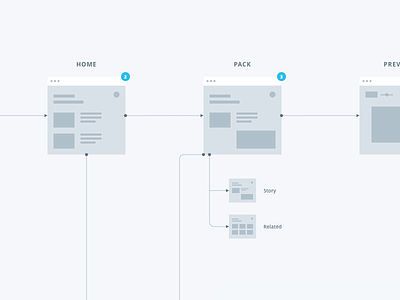
User Flow
How can we achieve the perfect dance steps if we don't start by finding the right flow? :)
This preview shows one of the possible scenarios we considered while working with the Death To The Stock Photo team on their new webapp. This one was designed to be a fullscreen and minimal experience.
I've been very much inspired by the work of the guys at @Focus Lab, especially @Charlie Waite concerning the way he organizes his flow. I find it really important to figure out what kind of user experience we want to provide and also to make things clear in our minds.
Can't show much more for now, but we're moving forward, and a few other shots may come so stay tunned ;)
Have a nice week everybody!
vince
More by Vincent Tantardini View profile
Like
