The Rotor Blog
Between feature work, I took on the task of redesigning our blog to solve some of the pain points and issues it had.
I had some goals in mind with this redesign.
1. Reduce the bounce rate by encouraging viewers to check out more articles and/or our product
2. Give our posts a feeling of authority as we aim to become an important voice and resource within the music industry
3. Mitigate the other UX issues that were apparent including the reading experience, mobile version, lack of engaging imagery in the blog, lack of links to relevant content from articles.
4. Gain more newsletter subscribers
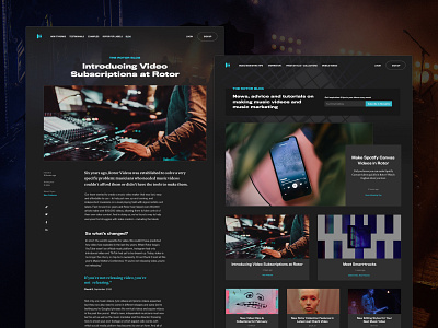
Design changes to the blog
I took the opportunity to expand our brand a little by introducing a new typography elements that help to give the blog a more authoritative, professional feel and made the content more engaging using images, animated gifs and video.
The typestack was redeveloped to give users a better reading experience on whatever device they view the Rotor blog on.
I replaced the tag clouds with more focused "Topics" to allow viewers to find the articles that interest them most and keep them on the blog for longer.
Related posts and links to relevant product information were added to each post as well, along with more prominent calls to action.
"Featured" and "most popular" articles were introduced to help keep the content feeling fresh
So far the blog redesign project has merited some great results as we've seen our bounce rate drop from an average of 68% to 25% in 2 months and we've collected more and more newsletter subscribers since the launch.
Check out the new blog — The Rotor Blog