QShala Re-branding
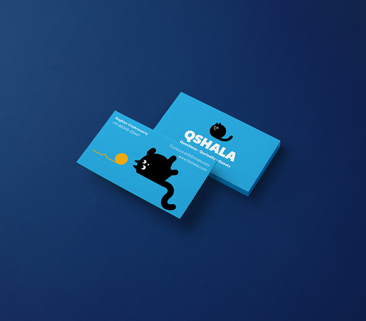
We worked on an Identity re-design for a quizzing platform based out of Bangalore.
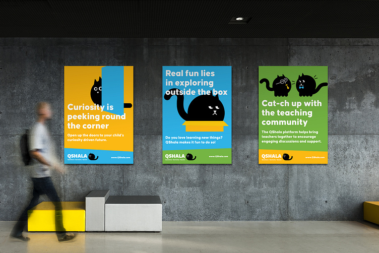
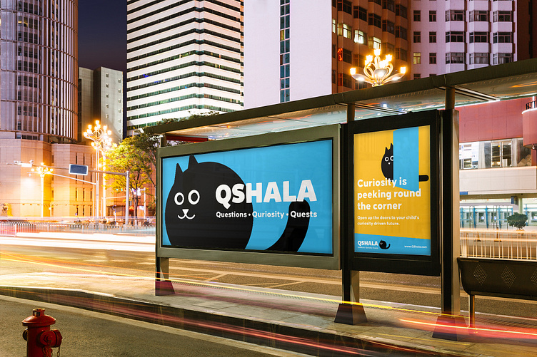
QShala is an essential learning platform that encourages creativity, curiosity and compassion. The brand’s primary focus domain is school going children and their parents.
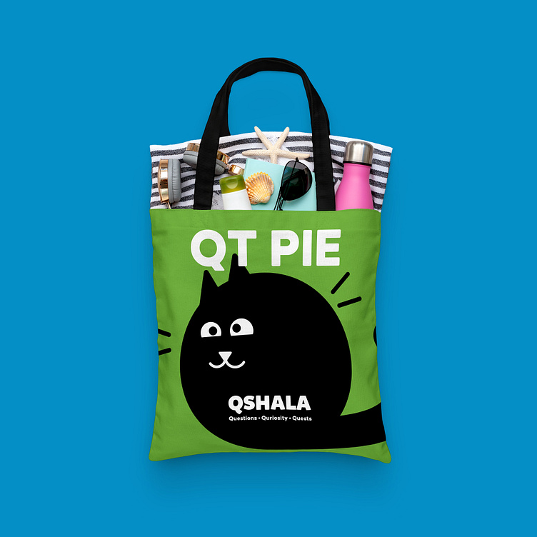
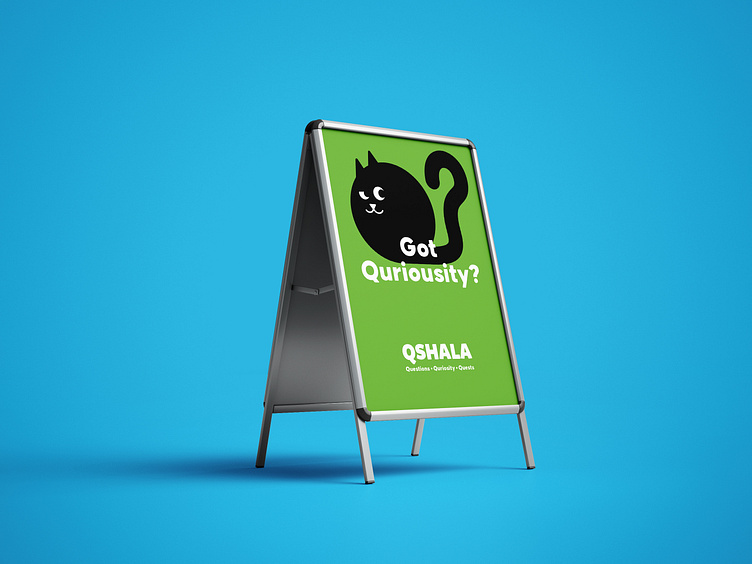
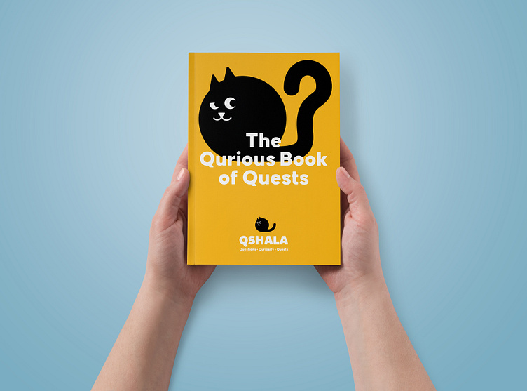
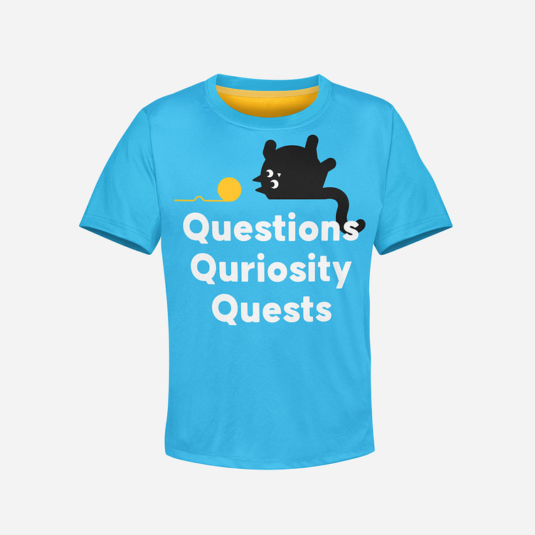
QShala’s identity system has a mascot, lovingly called QT. Inspired by the form of letter Q, QT is a curious being that embodies every trait of a constantly curious, exploratory, creative cat. It rolls, it falls, it sticks out its tiny paws to reach out for wool and everything else that we love about curious cats.
The copywriting uses these visual metaphors to translate communication for parents, children and teachers effectively and succinctly, without breaking character and losing the curious and fun spirit. The colours work towards aiding this simple yet bold visual language system to speak to the audience exploring the connection with QT and curiosity.