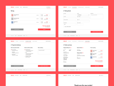
Voala Checkout Process
You are right.
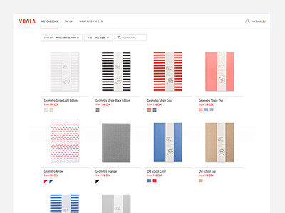
I finished my Voala sketchbooks project and have more to show! This is a checkout process with 4 steps: my bag, billing details, payment & delivery, summary and thank you page. Each screen has the same layout based on 1140px grid and I keep 3 main columns for the content. Everything is left-aligned and you can continue or go back using two big buttons in the bottom.
Pssst, I just published the whole Behance Case Study, so don’t forget to check it for more details :)
Happy Monday!
More by Ales Nesetril View profile
Like


