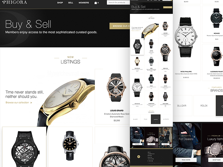
E-Commerce Homepage
Phigora is a new site that is about to launch where people can buy and sell luxury items. I had the opportunity to design their site.
The watch without the text and the dark brand box are the rollover effects.
To increase conversions I designed a very short hero section which allowed the products to peak above the 600px fold. Though screens are bigger today, analytics suggest that the fold is still around 600px for most users. Any thoughts?
Since the products are high priced, it was decided that users would like to see the full name of the product which usually is a short description of the make, year and material.
Follow me here and Follow me on Tumblr
More by Wunmi View profile
Like
