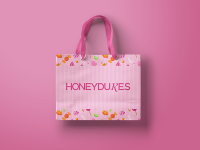
Honeydukes Rebrand Harry Potter Candy Store Logo Icon #2
My take on Honeydukes, this weeks #theglowandgrowclub challenge! 🍭
Clearly I went a very modern, minimalistic and monochromatic route (my 3 favourite ‘M’ words lol) but I think I’m liking it!
Can’t wait to work on it some more and make it a little more magical! ✨
What do you think? Do you like a more modern approach or the classic hogsmead vibes? 💕
Instagram ✨
https://www.instagram.com/designbyayelet/
Pinterest ✨
More by Ayelet Werner View profile
Like
