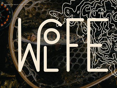
Branding for Wolfe Custom Works
Check out the detailed case study on my website.
Intro
Wolfe Custom Works is a veteran owned, one-man business offering custom, hand-made fly fishing and big game rods built in Kodiak, Alaska, collaborating with serious anglers all over the US.
Scope
— Logo
— Typography
— Color Palette
— Business Card
Approach
For the mark to fit right, and inspire the right target audience for WCW, I knew it needed to speak to both the creativity and intention that goes into each custom build, but also feel aligned with the wild places and people that use these rods. These considerations led me to an aesthetic that was clean and hand-lettered, but also carried a subtle vintage flair which was accentuated with the color palette and felt aligned with the adventurous spirit of other well-worn outdoor brands.
The stacked and asymmetrical approach to the primary mark not only felt organic in nature but also subtly wild and created visual flow when paired with other natural-seeming elements and graphics. In addition to the primary mark, we also collaborated on some alternate supporting marks to provide flexibility across touch-points, like a simple icon which could be used as an extra-small vinyl sticker to adorn each finished rod with the maker's signature.
You can see more of the WCW brand here and follow along on my instagram.


