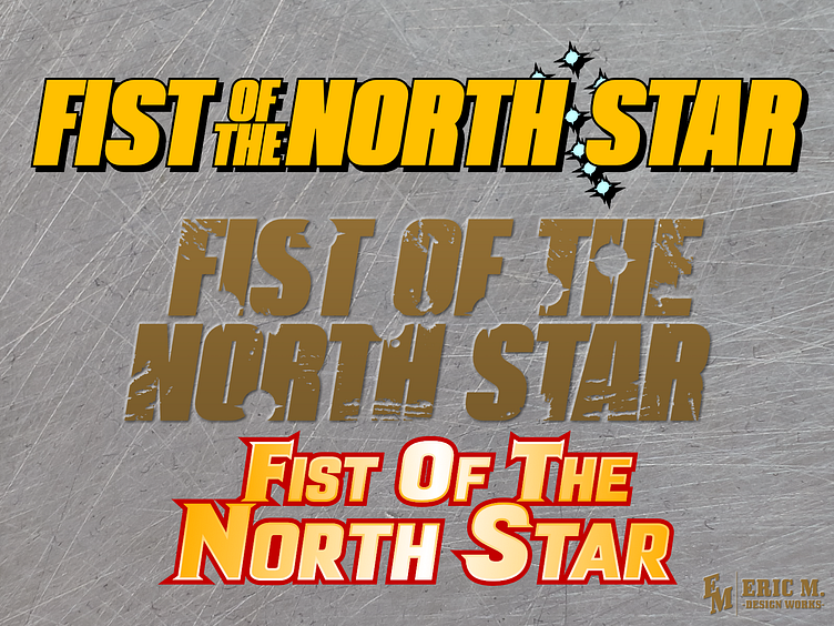
Concept: Fist of the North Star English Logo
One of my all time favorite series is Fist of the North Star. The classic combo of pairing Mad Max post-apoc aesthetics with a Bruce Lee movie. A tale of one man's journey through the wastes to stop his evil brother to bring peace to a lawless land.
You know it, I know it, THE WORLD KNOWS IT. Even if you haven't sat down and watched an episode of the anime or read a chapter of the manga, you've seen SOMETHING from it. Probably the classic line 'Omae Wa Mou Shindeiru' or Kenshiro's barrage of fists that come before the immortal phrase.
Weird thing though, despite being famous and well known, FOTNS has always had a weird prescence in the West. It's been around since the original manga's run, but it's been a sort of 'here and there' kind of run. As such, the series never had a proper english logo. It's always been a dice toss as to how it looks, even when the japanese logo more or less had it on lock since day one.
So me being who I am, I took a crack at designing my own english logo designs based off the original japanese look and some variant.
First is one based off the anime take, with it's bold lettering and bright yellow. Second is based off a recent take that I think was used for that weird, e-book release. The grungy, damaged look fits perfectly with the story's aesthetic imo. And third is based off one they kind of use all willy-nilly for whatever merch they're releasing this week, like this board game!
Will they ever have a uniform english logo? Probably not because who would give enough of a care about it besides me, hah. Still, Viz could do better than what they're using for the recent editions.
---
Twitter | Portfolio Site | Open for Commission and Freelance work, DM if interested!
