🎨 Introducing neutral palette | MESH
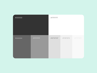
We use this set of neutral hues to build UI, structure layouts and establish clear hierarchy, ensuring smooth layering of backgrounds and foregrounds. They also add a calming effect to our designs, while allowing the bold elements to take the centre stage.
Always-so-classy shades of white and grey make the space feel more open, clean and fresh.