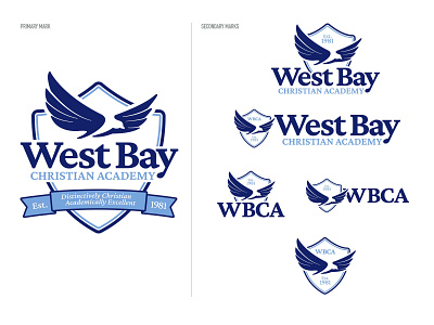
West Bay Christian Academy Rebrand
Building off the brand designed for it's 40th Anniversary, West Bay Christian Academy wanted a mark to help usher in a new and much needed refresh of the schools primary brand identity. On the heels of celebrating 40 years, the Board of Trustees asked me to design an identity to help look ahead to the next 40. The logo was designed with adjustable elements that would allow for flexibility depending on the varying environments the mark would be used. Taking the history of the school into consideration, I created used a modern serif typeface while also creating a new eagle and introduced a new blue to replace the old gray secondary color. We are in the process of updating everything from letterhead and brochures to apparel and campus signage.
