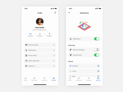
Learning platform - profile/notifications
Hi Guys!
Most basic screens but also important like the others. Clean and simple minimalism on both with a little accent of color. From the profile user should always have view on his personal information and information related to his account.
Don’t foget about managing notifications. You don’t want to get a bunch of alerts. They are really annoying and I think all of you will agree with me. That is why I wanted to show you personalization for the notifications.
More by Adrian Witek View profile
Like
