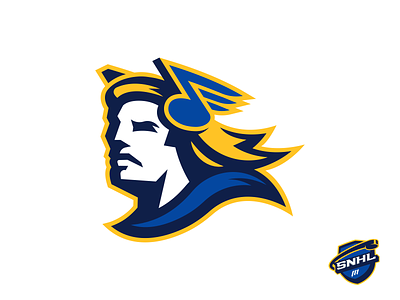
St. Louis Blues - Sean's NHL
I have to actually provide some explanation here because it's a bit of a thinker. Most teams are conceptually obvious - "The Jets are the Jets, here's a picture of a jet", etc. The "St. Louis Blues", however, named after a song, exist in the abstract and they've captured it perfectly with the blue note, which is one of my personal favorite logos in sports. But for the challenge of creating an alternative concept logo I wanted to avoid the standard musical imagery and the Blues themselves treaded that territory in the 90's with their trumpet logo. I also wanted to avoid the standard St. Louis Arch imagery. Stay with me here because I'm proud of the walk I took on this one - this is Apollo, the god of music, and the god of...are you ready...ARCHery. He's also looking "west" because St. Louis is the gateway to the west.


