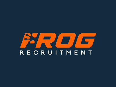
Wordmark Logo Design For A Recruitment Agency
For this project we wanted to demonstrate the power of negative space in a logo design. We took this approach by constructing the webbed foot of a frog and combining it with the letter 'F'. This gives the recruitment company a creative point of difference that can be applied to collateral. We selected a bright orange to enhance the vibrant nature of the brand and italicised the name to represent fast growth and development.
Hop To Us To View More Projects
Follow the White Rabbit 🐇 Website | Instagram | Facebook | Behance | Pinterest | YouTube
Like what you see? contact@whiterabbit.nz
More by White Rabbit View profile
Like


