SocialFlow Design System / UI Kit Components


Starting with the logo and brand style guide by Tishon Woolcock, we expanded on this core identity to grow in lockstep with the product offerings.
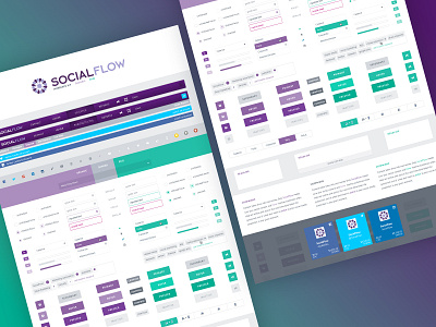
As we began to help publishers and brands with paid amplifications, we introduced organic (shades of purple, our core bread and butter color) and paid (shades of green—the opposite end of the color wheel and the color of our daily bread) color palettes. The UI design system similarly is bifurcated into organic and promoted to give users a visual cue whether they're publishing organically or amplifying with paid.
See the full case study on SocialFlow's product design
