Crunchy promo
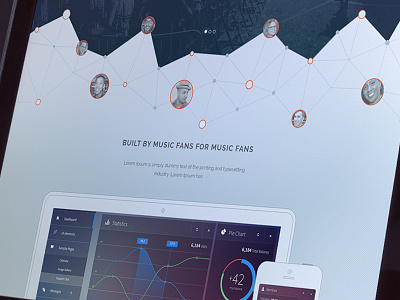
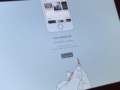
So I am trying to break up some of the modular aspects of the landing page by disrupting the visitors' line of sight and avoiding straight edges between content sections. I am using the graphic above the hero promo to get the use to stop an d look at the hero image and not get scroll happy. What do you guys think?
More by Noble IO View profile
Like

