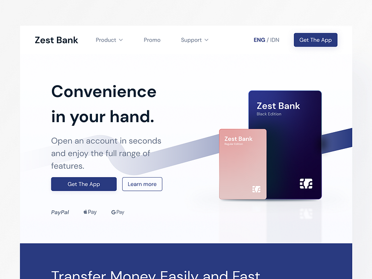
Exploration - Bank Landing Page
Hello! See you again on dribbble.
This time I created an exploration UI for a bank landing page with a clean, neat, and bright concept. The use of blue in this design aims to give the user a sense of trust when using the landing page, where the blue color is psychologically related to trust, which is in line with the banking business that puts forward the concept of trust.
I hope you like this design. Follow me and don't forget to hit that "L" button! ❤️
I am open to collaborating with you in making UI designs. Please contact me by email: farizanshar60@gmail.com
More by Fariz Anshar View profile
Like
