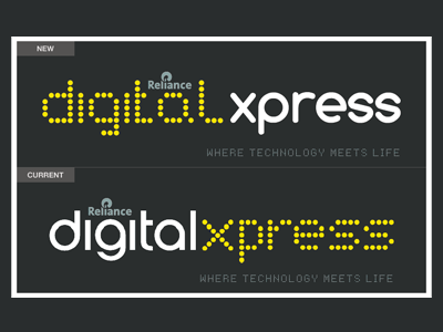
Redesign of Logo
Reliance Digitalxpress is one stop shop for digital products, mobiles, laptops, appliances etc.
In my opinion current design doesn't meet the actual meaning of words used in this logo like Digital and Xpress. I used dot based font in word digital which matches with its meaning. Dots are representation of digits.
In India Express 0r Xpress are normally used with something which is fast and moving like trains, therefore I had used smooth edge font.
Normally when we see super fast sports cars and trains their edges are made as smooth as possible so as to not hindered by resistance of air.
I hope you like it !
More by Shabir Gilkar View profile
Like

