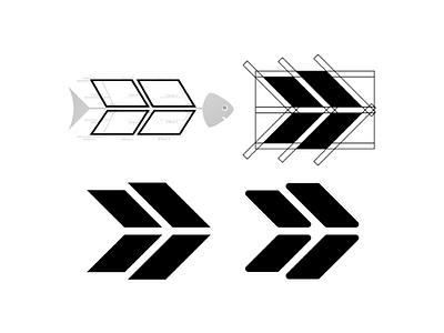
AWS Continuous Improvement Logo
We used 4 different simple shapes that were drawn using the fishbone as a guide, and because of that, a part of the fishbone can be seen in the negative space. Finally, we decided to round the corners a little bit to give it a more friendly look and also to match it with the rounded corners of the Ember font.
More by Alex Fantor | Brand Designer View profile
Like
