Katana Vault UI - Dark Mode, Desktop
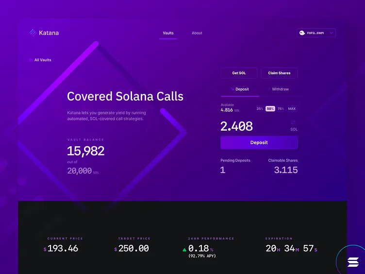
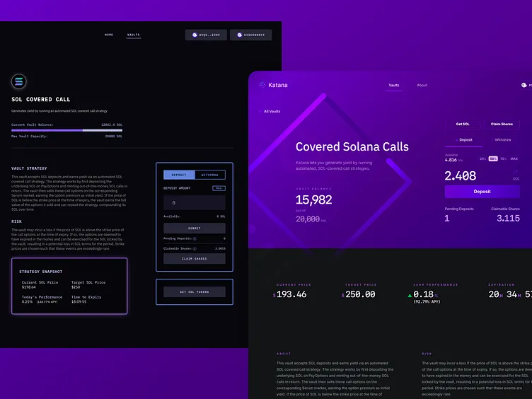
Katana is an exciting project, and while I love the application, the UI and UX could be a bit better. I re-designed the UI to provide a modern aesthetic, and improved the UX by placing an importance on the visual hierarchy of different page elements. <br>
In the Discord, several users were reporting that the font-size of the original application was too hard to read, and that the dark mode needed a bit of a color added to it. I addressed both of these issues in my re-design, and am working on a light mode version of the UI to address users' requests for such a feature.
Issues with the current UI/UX that I addressed:
• Small font-size, that makes certain elements of the page difficult to read
• Inconsistent visual hierarchy that places some elements larger than others, when they are actually less vital to the user experience
• Visually, the page feels a bit lacking, so I wanted to make the design more visually enticing
Additionally, I tied in some brand elements, utilizing the Katana logo and it's overall "cube" bounding shape to establish a more memorable experience.
Check out the second image to see the before & after of the UI. Let me know any thoughts/questions you have.