Academia.edu
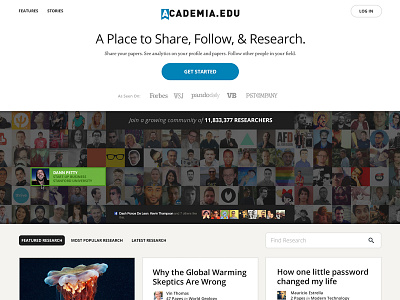
I've been working on an idea for the redesign of Academia.edu. My main goal here was to show more "proof" of what Academia can do without too much "talking" on their homepage. I did this by pulling out featured research papers and making them visible here. You can filter by Featured, Most Popular and Latest. This shows proof of the level of research that's happening on Academia.
I wanted to make the avatar row of the researchers interactive so you can click through to those top researchers. This helps to show how massive/real the community is. Also up top above the researcher avatars is a roll call for the press logos. Brought this up front for a quick claim stamp.
And lastly, I used Twitter testimonials to prove that real people said real things about Academia.
Hope you dig. Check out the new logo exploration as well. I post a separate shot for that shortly.
--
BTW, Academia is hiring a product designer to lead the show right now if interested!
Follow Academia: @academia
Follow me: @dannpetty

