Amazon's Mobile App 🛒 | Redesign

Hey Dribbblers,
Today's shot is a bit ambitious.
I want to introduce you to our re-design of Amazon's mobile app.
Yep, even such big giants can be improved in terms of UX design.
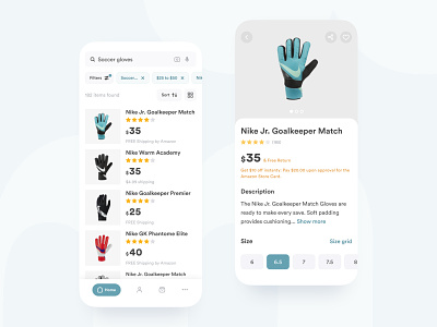
After research, we discovered that users shopping on Amazon for the first time find Search & Result pages unclear, category filters non-customizable, and Product page over cluttered.
So, what we changed:
• Highlighted the main and secondary info on the Result page;
• Added number of search results;
• Changed padding between products list;
• Made price filter customizable;
• Moved elements on the Product page;
Throughout the re-design, we removed guesswork and assumption from the app flow. The result is an enhanced app that provides a better user experience than ever before.
You can read the full case study on Behance and our blog.
I hope you'll enjoy the case study. If that's the case, don't forget to Press L
Made with ❤️ at Uptech
Check out more our works on Behance, Github.
Do you have a project you'd like to collaborate on? Email us at hello@uptech.team