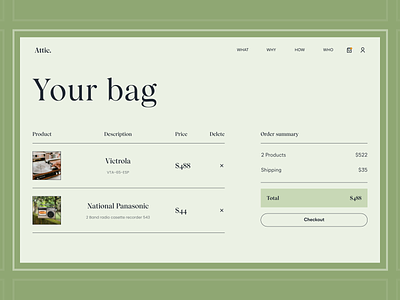
Attic | E-commerce Antiques. Payment
Hey, creatives!
We want to show you the checkout page of our vintage store concept. The payment page design gives customers the ability to enter payment details and complete their orders. We've created a user-friendly, easy-to-reach, and high-performance checkout that will improve the shopping experience for customers, reduce checkout bounces and improve conversions.
Do you think we have coped with the task?
Like it? Don't forget to follow Axicube! ➡️
You can also find us here: Instagram | Behance | Linkedin | Facebook
May the Force of UI/UX be with you!
More by Axicube View profile
Like
