Björkhem
Branding of the newly founded law firm Björkhem.
Björkhem is a newly founded law firm in Stockholm, Sweden. Founded by Emil Björkhem they set off to help founders and entrepreneurs with strategic and legal advisory. Emil’s ambition was to match the visual identity with their offerings of innovative and tailor-made solutions in a way that feels dynamic and cohesive with a clear visual hierarchy. For him it was important to steer away from the meaningless imagery and bland typography that this industry is used to seeing.
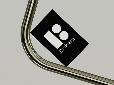
The Björkhem brand identity originates from the core concept of Lady Justice – the goddess of justice within Roman mythology. The identity is bringing out her two main attributes; the sword and the two scale bowls to create an abstract shape that can read as the letter B, for Björkhem. The attributes symbolize fair and equal administration of the law, without corruption, favor, greed or prejudice. In the Björkhem brand identity the scale bowls are used to encapsulate the truth and justice, while the sword lays the mark and acts as a device to guide viewers to where to pay attention. The attributes also play their part in creating patterns to communicate scale and dynamism.
This project was designed independently with conceptual assistance from Kerstin Marie Fröhlich.
Client: Björkhem
Design and Art Direction: Erik Herrström
Creative Assistance: Kerstin Marie Fröhlich
Typefaces: Ivy Presto by Ivy Foundry and Europa by Europa Type.
More here:
