Mode
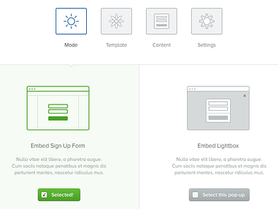
Here is some more work on this project. I understand that the line with the arrow may not be as pronounced as it should. Also curious to know if you think the two 'sign up form' icons convey well? Regular sign up form vs lightbox/modal?
—
Be sure to check out the @2x attachment.
—
Say hi: @jamesm
More by James View profile
Services by James
Like

