GIF Exercise
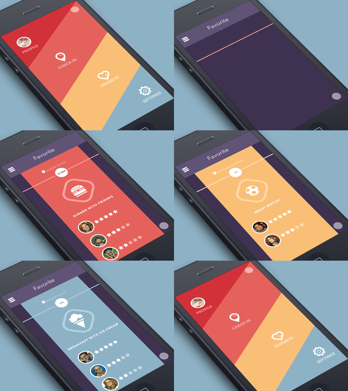
Hi everyone! Besides my ongoing projects I like to create some concepts just for fun. The app topics are often very similar and bringing them to life turns out to be much alike with everything already existing. So what? Does that mean that there should be thousands of look-alike apps with similar design in the market? Right for this purpose our studio tries to find different ways to visualize standard elements, e.g. controls. Today for example I'd like to present you a concept of horizontal timeline and sliding menu opening. The accent is to squashing animation during a swipe so that the menu doesn't distract but bring certain visual fun while exploring the news feed. The sliding menu expands diagonally, so are its icons located. We've noticed that main actions on a smartphone are done with a thumb and here for faster and more convenient selection the thumb will slide diagonally. Hope you like this little exercise for mobile interface designers. Behance | Instagram | Twitter | Facebook | Tubik
