Survey Results
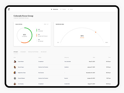
Analyzing data is extremely important to receive insights. In our opinion, visualizations & infographics are the best way of presenting a complex set of information in a simple form. Highlighting the main elements helps easily digest massive data amounts in seconds.
📩 Let’s create something powerful together!
Dashboard.jpg
700 KB