Daily UI challenge, first day, first challenge :) Sign up page

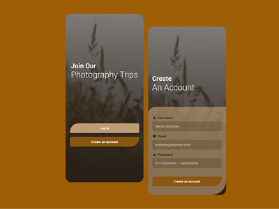
Just started my 100 days of dailyui challenge, here i am with a sign up page. I tried to be careful with accesibility ( tappable area sizes, contrast of AA level, clear and always visible labels, placeholders' legibilities etc..) and also give some aestheticly pleasing vibes.. Please correct me so i keep learning :)