Solstice & Frosty Brewing Co. Logo
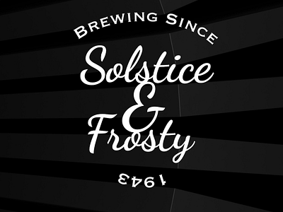
This logo is wonderful, providing that christmas and winter feel, whilst also having a modern and creative logo style, the big & bringing the two words together to feel like one.
To start I drew the font with the pen tool, and made sure the font had that winter feel. I then move them to ensure that the look was centre for both words.
To finish off I made the 'brewing since' curved to ensure that circle feel.
Share your opinions.
Digital Cobweb: info@digital-cobweb.co.uk
