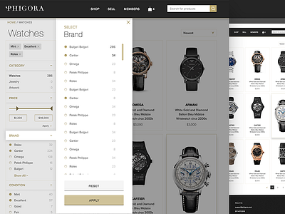
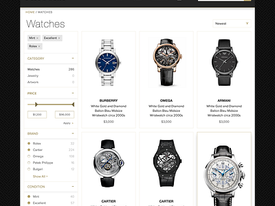
Category Page & Menu
Hey ballers, I recently finished designing the category page for Phigora while working with @NANO Web Group. This is the menu that pops up when a user clicks the "See All" link within the accordion. I used this approach because it is easily translatable into mobile as a peaking menu.
Be sure to check out the attached.
The product cards would look prettier if the titles were shorter, but I'm sure it would hurt conversions because the usually includes specific details which users like to know right away. The big card is the rollover effect.
Follow me and
Follow me on Tumblr
More by Wunmi View profile
Like

