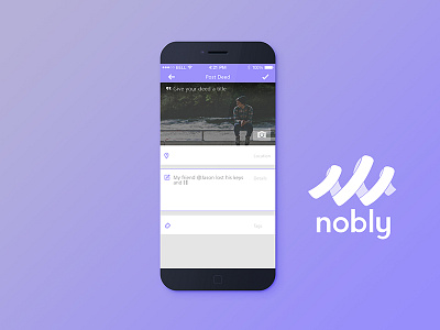
Nobly Post Deed
So this isn't as "exciting" as some of the other screens, but we wanted to provide a clean and simple means for posting a deed in the system. That said, I'd love any suggestions you may have for improvements.
Not sure how I feel about having the input labels on the right as opposed to beside the icon.
And for anyone who's interested, we are updating our landing page with some new content, the beginning of which can be seen at the pay it forward network
Thanks!
More by Josh | Nobly View profile
Like

