Daily UI 080 - Date Picker
Challenge 080: [no description was given]
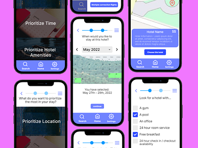
Surprised to see I already did this somewhat in previous challenges. I chose to expand on my Flight Search and Hotel Booking challenges by enhancing the date selection screen. I created more selection options, such as a dropdown menu and left and right arrows to easier navigate the calendar. Selected dates are highlighted in green on the calendar and are written in text underneath it for increased legibility. The rest of my thought processes can be found in those previous challenges.
This prototype was made in Framer.
More by Jason Villanueva View profile
Like
