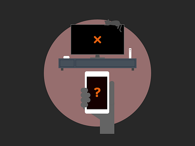
Firefox Channel on Roku
Working on the interface for our upcoming channel on Roku that will come with some helpful little illustrations. Everything is leaning towards the darker more saturated side just to adjust for HD/ larger screen that tend to cause more "visual fatigue". It's also just a lot nicer to look at in a cinematic context/setting.
More by Anthony Lam View profile
Like
