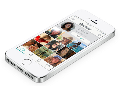
15winks UI
This is the settings screen for the 15winks app. It shows a primary generic video that everyone gets, as well as the paid portion which is slated for nine additional videos. These 15 second videos give a user things an online dating site could never show: Tone, inflection, personality, etc. These squares show up blank with a “+” icon in the center. Once they click the box they have the option to select a category and then the app guides them right into recording the video for that square. This UI design won a Platinum HERMES award while I served as the Creative Director on the project.
More by Martin Merida View profile
Like
