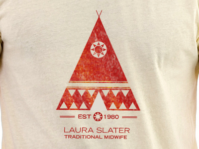
T-Shirt Design
I'm working on a basic one-color design for a limited run of shirts that I'll be screen-printing.
My wife and I have had two of our three children at home with our incredibly rad midwife, Laura Slater.
So we're putting together a little event for her and wanted to have some of these available for other clients who will be attending. I've shown a couple designer friends and they commented on removing all the type and put more focus on the TP and make it a cool shirt design with no connection.
However, my goal is to promote her and bring awareness to midwifery and home birthing. I think having her name and role on the shirt could potentially spur a conversation whereas with no connection it may not.
I've played with removing it or arranging it differently.. but am not sure.
Any thoughts/feedback on the design in general? Do you think the type takes away, hurts the design, or feels weird?
I would like it to appeal to men, women, and even screen-printing up some onesies.
Thanks!
