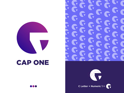
Cap One Logo Project
My design concept: As you can see in the logo, I have created this by combining the two letters which are C & 1. I decided to combine the numeric letter (1) instead of the regular letter ONE to keep the logo simple and elegant.
Don't forget to like and share your thoughts about this design 😄
-
I'm available for freelance project:
------------------------------------------------
📩 : design.dollardope8@gmail.com
BEHANCE I FACEBOOK I INSTAGRAM I LINKEDIN I TWITTER I FIVERR I TUMBLR I REDDIT I DEVIANART
More by Kazi Faiz Ahmed View profile
Like
