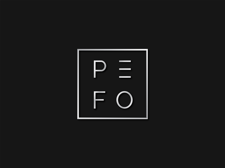
Logo PefoMilling
What up folks!
The idea of the logo is based on the four sides of a square or rectangle and the four letters of the logo, these are the basic geometric shapes that most often occur in the technical focus of the company. When you change the square format, the letters adapt to the new geometry and remain in the corners.
If you like it leave a like or comment.
Thanks!
For more follow me on: Behance, Linkedin, Instagram
or contact me at: thajducak@gmail.com
More by Tomáš Hajdučák View profile
Like
